Overview
Digital documents (e.g., Word, PowerPoint, and PDF files) are required to meet Web Content Accessibility Guidelines (WCAG) 2.1 standards.
Without intentional actions, most digital files are not accessible out-of-the-box. This page lists ways to make several common file types more accessible.
Minimizing the use of hosted documents, especially PDFs, is the single best thing you can do to improve the accessibility (and overall user experience) of your digital content and services. Whenever possible, add content directly to a website instead of uploading documents.
PDF Usage
PDFs should only be used if:
- It is essential that layout and format be preserved precisely (e.g., for posters that will be printed or for certain types of legal documents)
- A digital form must be filled out by people who cannot complete the form via a website (e.g., due to limited internet access)
Documents created in Microsoft Office products (Word, PowerPoint, etc.) should be kept in their original format, information that will be posted online should be posted as a web page (i.e., HTML), and email newsletters should be provided as HTML email content.
Creating Accessible PDFs is a lot of work for poor results
Making PDFs accessible is time-consuming and laborious, and even the most accessible PDFs are less accessible than properly formatted web pages. All PDFs require manual review and revisions before they can be uploaded and published. Even if the source document (like Microsoft Word) is formatted perfectly, you will likely need to make manual changes within Adobe Acrobat Pro after you export the file to PDF format.
Complex documents can take hours to make accessible as PDFs, and if you export a new version, you will have to restart the process of remediating the PDF
PDFs are not mobile-friendly
You might create and manage most content on a desktop computer, but most content is consumed on mobile devices. PDFs do not display well on smaller screens (unlike web pages), requiring users to constantly zoom in and out to read content, their layout and formatting are not responsive, and text does not automatically reflow to fit the screen.
General Document Recommendations
If you opt for hosted documents, follow these accessibility techniques, which apply to all file types and all platforms.
Images of Text
Images of text are inaccessible and should not be used unless a particular presentation is essential and cannot be achieved in any other way (e.g., a logo that includes text). When the only source of a document is a scan or image of text, the text should either be processed via OCR (Optical Character Recognition) and verified/corrected to ensure that it is accurate, or it should be retyped as actual text on the page.
Describing Images
Images are inherently inaccessible to people who are unable to see them. All common content editing software allows the content editor to add an image description, commonly called alt (alternate) text, to an image.
- Alt text is not visible on the page, but gets read by screen readers. It should describe the content contained within the image in a brief sentence or two, and in fewer than 125 characters.
- Don’t include “Photo of...”, “Image of...” etc., in the image, as screen readers will announce the media as an image before reading the alt text.
- Most content editing software has the option to flag images as decorative. If the image is purely for visual effect and does not contain meaningful content, mark it as decorative.
- This tells screen readers to skip over this content.
- If the image is not marked as decorative, and does not have alt text, some screen readers will read the file name of the image (e.g. stylized_horiz_graphic.jpg) which is a poor user experience.
- If there is not the option to flag an item as decorative, but you can manually edit the alt text, give it an empty text string (e.g. alt=””).
- Complex images, such as graphs and infographics, cannot be sufficiently described within the parameters of alt text. Provide a brief explanation of the complex image in alt text, then provide a more thorough description of the graphic as plain text on the document. This is more accessible to everyone, including people with full sensory perception who might have difficulty understanding the graphic. Note that in HTML web content, this can be handled with the longdesc attribute, but this functionality is not available on uploaded documents like PDFs.
- If for some reason you are not able to add alt text to an image that needs it, add an image caption beneath or adjacent to the image that is visible to everyone.
Color Contrast
It is important that colors sufficiently contrast against each other so all content on your media is readable. This applies to text against solid backgrounds, and to text in front of images.
- As examples, yellow text on a white background, or dark grey text on a black background is hard to read, vision-impaired or otherwise.
- The color contrast between two elements needs to be at least 4.5:1 for regular sized text, or 3:1 for large (18pt or 14pt bold font) text. More contrast is always better.
- Use a color contrast checker to see if there is sufficient color contrast between the text and background. Avoid putting text over top of images and patterns when possible. If necessary, add a tinted color overlay behind the text so it stands out more against a background.
- UO green and UO yellow provide sufficient contrast for web accessibility requirements when placed on top of each other. If you want to use other UO color combinations, check the UO Color Contrast page.
- Logos are exempt from color contrast requirements.
Identifiable and Meaningful Links
To ensure the links in your documents are accessible, they should have meaningful link text, and be visually identifiable by some means beyond color alone.
- Links are commonly styled using blue text. This is permitted, but there should also be some other means of identifying that text is a hyperlink. This is most commonly done by making the links underlined. If that conflicts with your style guidelines, you may alternately make links bold (if in HTML, use the <strong> attribute, not the <bold> attribute).
- Link text should be meaningful, it should clearly tell the user where it goes. Text like “Read More” is ambiguous and should be avoided. Avoid using the same link text to link to different destinations. Similarly, avoid using different link text to link to the same destination.
Examples of good link text:
- More information can be found in the 2023 tuition tables.
- Schedule an appointment with an advisor if you have any questions about class registration.
Examples of poor link text:
- More information can be found in the 2023 tuition tables. Learn More.
- Schedule an appointment with an advisor (https://advising.uoregon.edu/content/connect-with-advisor) if you have any questions about class registration.
Use Structured Data Whenever Possible
Most content editing software has preformatted options for presenting content. For example, Microsoft Word and Powerpoint have different tiers of Headings available, that will make the text larger, change the color, add line spacing, amongst other stylistic changes. Using these types of structured data to convey content organization and hierarchy is always recommended. Using structured data also adds meta data to the content, information that is not visible on screen, but allows assistive technologies to understand the layout and structure of the document content
- For Headings, use the Styles pane in Microsoft products, versus directly editing the font styles. If you don’t like the default styles provided by Microsoft, use the Styles pane first (which adds meta data) then go and revise the styles afterwards.
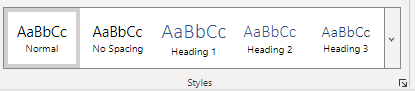
The Styles pane adds meta data and is more accessible.
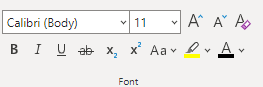
Directly editing styles does not add meta data and is less accessible. Only revise these styles (font family, color, size, etc.) after you’ve already marked up your content using the options in the Styles pane.
- Use the predefined numbered list and bullet list options. This provides structure to the lists, and allows screen readers to understand that this is content presented in list format. If you try and “fake” a list by manually adding hyphens to regular paragraph text, it visually looks like a list, but lacks the underlying structure. If you dislike the default bullet / numbered list styling, create it using the built-in list tools, then restyle afterwards.
- The structured layout options will vary substantially by platform. In general, if a structured element is available, use it!